데이터 사이언스 07 시계열 데이터 01-statsmodels
- 1. 시계열 데이터 - using Numpy
- 2. StatsModels : 예제1 - 비행기 여객
- 3. statsmodels - 시계열 데이터(Time Series)
- 3. statsmodels : 예제2- 하와이 대기 CO2비중
1. 시계열 데이터 - using Numpy
- 시간 순서로 되어 있는 데이터를 표현하기
- 위 데이터를 방정식으로 표현하기
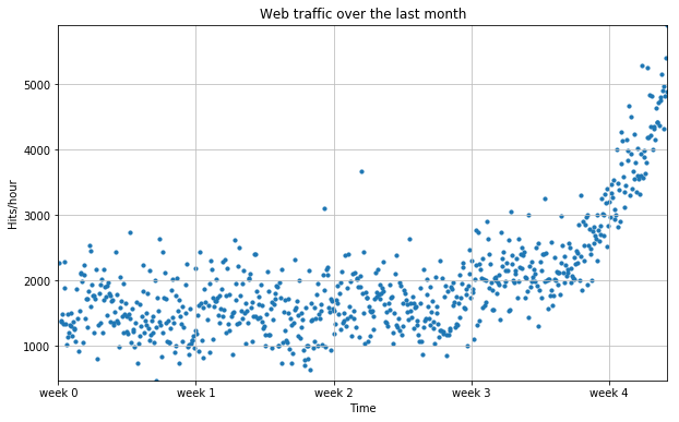
1) 예제 1 - 웹 트래픽 분석
- numpy에서 텍스트를 읽는 함수 :
numpy.genfromtxt - 탭(
\t)으로 구분되어 있다고 설정한다. -
원본 데이터(raw data)는 1열이 한 시간 단위, 2열이 웹페이지 hit이다.
- raw data(./data_science/web_traffic.tsv) 에서 시간축(1열)과 hit 수(2열)로 분리하기
import numpy as np
import matplotlib.pyplot as plt
%matplotlib inline
data = np.genfromtxt("./data_science/07. web_traffic.tsv")
data
array([[  1.00000000e+00,   2.27200000e+03],
       [  2.00000000e+00,              nan],
       [  3.00000000e+00,   1.38600000e+03],
       ...,
       [  7.41000000e+02,   5.39200000e+03],
       [  7.42000000e+02,   5.90600000e+03],
       [  7.43000000e+02,   4.88100000e+03]])
# 첫번째 열 [ : , 0 ]은 시간(x)
# 두번째 열 [ : , 1 ]은 hit수(y)
x = data[:, 0]
y = data[:, 1]
# 의미없는 데이터 확인
np.sum( np.isnan(y) )
8
# 사용가능한 데이터 얻기
x = x[~np.isnan(y)]
y = y[~np.isnan(y)]
2) 시각화
# 그래프

plt.figure( figsize=(10, 6) )
plt.scatter( x, y, s=10 )

plt.title("Web traffic over the last month")
plt.xlabel("Time")
plt.ylabel("Hits/hour")
plt.grid( True, linestyle='-', color='0.75' )
# 데이터가 가급적 화면에 꽉 차도록 autoscale을 적용함
plt.autoscale( tight=True )
# plt.xticks([A], [B]) ~ A라고 표기될 x축 라벨을 B로 표기
plt.xticks( [w*7*24  for  w  in  range(5)] , [ 'week %i' % w for w in range(5) ] )
plt.show()
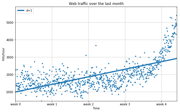
3) 에러 정의하기
- RMS
- 실제값( y )과 예측값( f(x) )의 차이( error )를 제곱하여 평균을 구한 후 root를 취한 값
- 1차 함수 f(x)를 구하기
def error(f, x, y):
    return np.sqrt( np.mean( f(x) - y )**2 )
# 1차 함수에서 기울기와 y절편을 구한다.

np.polyfit( x, y, 1)
array([ 2.59619213, 989.02487106])
# 위 기울기와 y절편으로 1차 함수를 만들기

fp1 = np.polyfit( x, y, 1 )
f1 = np.poly1d( fp1 )

error(f1, x, y)
8.2163875098942091e-13
4) 1차 함수 그래프
fx = np.linspace( 0, x[-1], 1000 )

plt.figure( figsize=(10, 6) )
plt.scatter( x, y, s=10 )
# 1차 추쇄선 삽입
plt.plot( fx, f1(fx), lw=4 )

plt.title("Web traffic over the last month")
plt.xlabel("Time")
plt.ylabel("Hits/hour")
plt.grid( True, linestyle='-', color='0.75' )
# 데이터가 가급적 화면에 꽉 차도록 autoscale을 적용함
plt.autoscale( tight=True )
# plt.xticks([A], [B]) ~ A라고 표기될 x축 라벨을 B로 표기
plt.xticks( [w*7*24  for  w  in  range(5)] , [ 'week %i' % w for w in range(5) ] )
plt.legend( [ "d=%i" % f1.order], loc=2 )
plt.show()
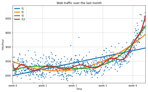
5) 2차 이상 함수 그래프
- 15차 함수에서 오히려 에러가 더 커진다.
f2p = np.polyfit(x, y, 2)
f2 = np.poly1d( f2p )

f3p = np.polyfit( x, y, 3 )
f3 = np.poly1d( f3p )

f15p = np.polyfit( x, y, 15 )
f15 = np.poly1d(f15p)

error( f1, x, y), error( f2, x, y), error(f3, x, y), error(f15, x, y)
(8.2163875098942091e-13,
 3.7122232725425643e-13,
 2.2149598859503965e-13,
 3.7538309301094562e-05)
plt.figure( figsize=(10, 6) )
plt.scatter( x, y, s=10 )

# 추쇄선 삽입
plt.plot( fx, f1(fx), lw=4, label='f1')
plt.plot( fx, f2(fx), lw=4, label='f2')
plt.plot( fx, f3(fx), lw=4, label='f3')
plt.plot( fx, f15(fx), lw=4, label='f15')

plt.title("Web traffic over the last month")
plt.xlabel("Time")
plt.ylabel("Hits/hour")
plt.grid( True, linestyle='-', color='0.75' )
# 데이터가 가급적 화면에 꽉 차도록 autoscale을 적용함
plt.autoscale( tight=True )
# plt.xticks([A], [B]) ~ A라고 표기될 x축 라벨을 B로 표기
plt.xticks( [w*7*24  for  w  in  range(5)] , [ 'week %i' % w for w in range(5) ] )
plt.legend( loc=2 )
plt.show()
2. StatsModels : 예제1 - 비행기 여객
1) 소개
- numpy 보다 통계치 표현에 더 유용한 도구를 사용하자.
- StatsModel : Python에서 통계 관련 함수와 모델링 기법을 제공하는 모듈이다.
2) 설치
➜ pip install -U statsmodels

Collecting statsmodels
  Downloading statsmodels-0.8.0-cp36-cp36m-manylinux1_x86_64.whl (6.3MB)
    100% |████████████████████████████████| 6.3MB 159kB/s
Requirement already up-to-date: pandas in /home/learn/.pyenv/versions/3.6.2/envs/Jupyter/lib/python3.6/site-packages (from statsmodels)
Requirement already up-to-date: scipy in /home/learn/.pyenv/versions/3.6.2/envs/Jupyter/lib/python3.6/site-packages (from statsmodels)
Collecting patsy (from statsmodels)
  Downloading patsy-0.5.0-py2.py3-none-any.whl (232kB)
    100% |████████████████████████████████| 235kB 1.7MB/s
Collecting numpy>=1.9.0 (from pandas->statsmodels)
  Downloading numpy-1.14.0-cp36-cp36m-manylinux1_x86_64.whl (17.2MB)
    100% |████████████████████████████████| 17.2MB 56kB/s
Requirement already up-to-date: python-dateutil>=2 in /home/learn/.pyenv/versions/3.6.2/envs/Jupyter/lib/python3.6/site-packages (from pandas->statsmodels)
Requirement already up-to-date: pytz>=2011k in /home/learn/.pyenv/versions/3.6.2/envs/Jupyter/lib/python3.6/site-packages (from pandas->statsmodels)
Requirement already up-to-date: six in /home/learn/.pyenv/versions/3.6.2/envs/Jupyter/lib/python3.6/site-packages (from patsy->statsmodels)
Installing collected packages: numpy, patsy, statsmodels
  Found existing installation: numpy 1.13.3
    Uninstalling numpy-1.13.3:
      Successfully uninstalled numpy-1.13.3
Successfully installed numpy-1.14.0 patsy-0.5.0 statsmodels-0.8.0
3) 예제 데이터
statsmodels모듈이 제공하는 R용 데이터들- 위 모듈의 목표는 기존의 R 유저가 python에서 동일하게 분석할 수 있게 하는 것이다.
import warnings
warnings.filterwarnings("ignore")

import itertools
import pandas as pd
import numpy as np

import statsmodels.api as sm
import matplotlib.pyplot as plt
plt.style.use('fivethirtyeight')
%matplotlib inline
df = sm.datasets.get_rdataset("AirPassengers").data
df.head(3)
| time | AirPassengers | |
|---|---|---|
| 0 | 1949.000000 | 112 |
| 1 | 1949.083333 | 118 |
| 2 | 1949.166667 | 132 |
- time 부분에 소수표현이 있다. 이를 datetime형식으로 바꿔보자
def yearfraction2datetime( yearfraction, startyear=0 ):
    import datetime, dateutil

    year = int( yearfraction ) + startyear
    month = int( round( 12*( yearfraction - year) ) )
    delta = dateutil.relativedelta.relativedelta( months=month )
    date = datetime.datetime( year, 1, 1) + delta
    return date
yearfraction2datetime(1949.333333)
datetime.datetime(1949, 5, 1, 0, 0)
import datetime, dateutil

dateutil.relativedelta.relativedelta( months=15 )
relativedelta(years=+1, months=+3)
df["datetime"] = df.time.map( yearfraction2datetime )

df.tail(3)
| time | AirPassengers | datetime | |
|---|---|---|---|
| 141 | 1960.750000 | 461 | 1960-10-01 |
| 142 | 1960.833333 | 390 | 1960-11-01 |
| 143 | 1960.916667 | 432 | 1960-12-01 |
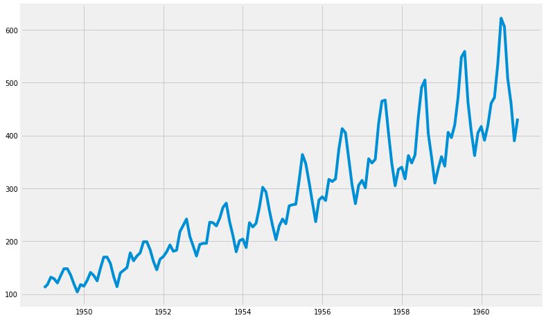
4) 시각화
(1) 그래프
t = df.time
y = df.AirPassengers

plt.figure(figsize=(12, 8))
plt.plot(t, y)
plt.show()
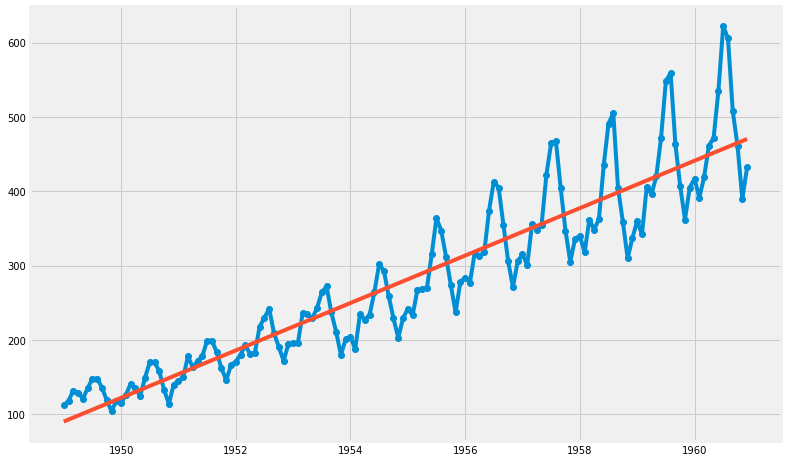
(2) 직선 추가
- OLS : Ordinary Least Square 함수
- AirPassengers ~ time 관계로부터, ➜ AirPassengers = param1 + param2 * time
result = sm.OLS.from_formula( "AirPassengers ~ time", data=df ).fit()
print( result.params )
print( result.params[0], result.params[1] )
Intercept   -62055.907280
time            31.886207
dtype: float64
-62055.9072797 31.8862068965
t = df.time
y = df.AirPassengers
trend = result.params[0] + result.params[1] * t

plt.figure(figsize=(12, 8))
plt.plot(t, y, 'o-', t, trend, '-')
plt.show()
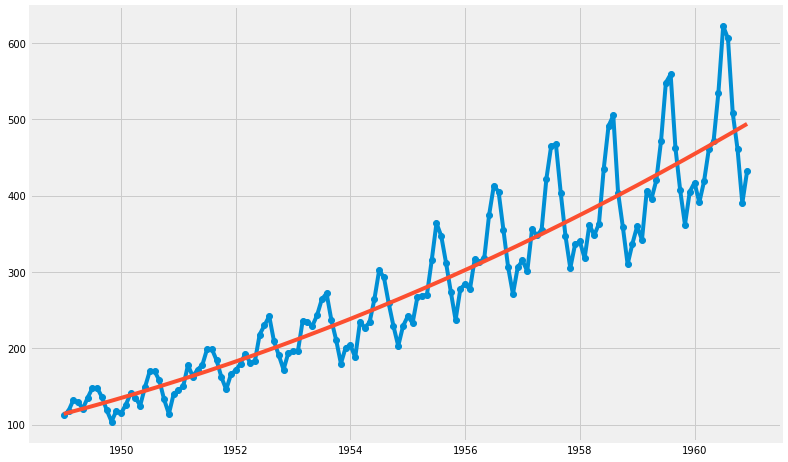
(3) 2차 함수
- AirPassengers ~ time + np.power(time, 2)
- ➜ AirPassengers = time + time^2
result2 = sm.OLS.from_formula( "AirPassengers ~ time + np.power(time, 2)", data=df ).fit()
print( result2.params[0], result2.params[1], result2.params[2] )
3794880.89376 -3913.9256755 1.00918055774
trend2 = result2.params[0] + result2.params[1] * t + result2.params[2]* t**2
plt.figure(figsize=(12, 8))
plt.plot(t, y, 'o-', t, trend2, '-')
plt.show()
3. statsmodels - 시계열 데이터(Time Series)
1) 시계열 데이터
- 시계열 데이터는 대부분 예측에 활용된다.
- 여기에서는 예측 모델로서 ARIMA 모형을 채택하였다. (Auto Regressive Integrated Moving Average)
- 과거의 관측값과 오차를 사용해서 현재의 시계열 값을 설명하는 ARMA 모델을 일반화 한 것입니다. 이는 ARMA 모델이 안정적 시계열(Stationary Series)에만 적용 가능한 것에 비해, 분석 대상이 약간은 비안정적 시계열(Non Stationary Series)의 특징을 보여도 적용이 가능하다는 의미입니다.
(1) 안정적 시계열 (Stationary Series)
- 평균 불변 (시간에 따라 변하지만 그 평균은 불변)
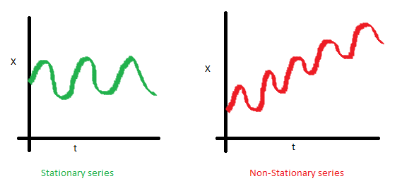
- 분산 불변
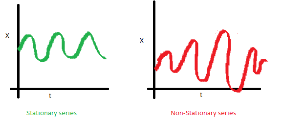
- 공분산 불변
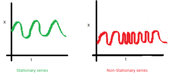
- 간단히 말하면, 모든 t(시간)에 대하여 통계치 p(x)가 동일함
(2) 비안정적 시계열(Non Stationary Series)의 처리
- 차분, 로그 등을 활용하여 안정적 시계열로 변환한 후 ARIMA 모형 적용함
(3) ARIMA 모형 ( Box-Jenkins approach ) 적용
자기회귀이동평균(ARMA) 모형 - 매우 좋다 !!!
1단계. 시계열 자료를 시각화 해서 안정적 시계열인지를 확인한다. Visualize the time series
2단계. 시계열 자료를 안정적 시계열로 변환한다. Stationarize the series
3단계. ACF/PACF차트나 auto.arima 함수를 사용하여 최적화된 파라미터를 찾는다. Plot ACF/PACF charts and find optimal parameters
4단계. ARIMA 모형을 만든다. Build the ARIMA model
5단계. (필요한 경우) 미래 추이에 대해 예측한다. Make prediction
2) 대상 데이터 얻기
%matplotlib inline
import pandas as pd
import numpy as np
import matplotlib.pyplot as plt
import datetime
from dateutil.relativedelta import relativedelta
import seaborn as sns
import statsmodels.api as sm
from statsmodels.tsa.stattools import acf
from statsmodels.tsa.stattools import pacf
from statsmodels.tsa.seasonal import seasonal_decompose
df = pd.read_csv( './data_science/07. portland-oregon-average-monthly-.csv', index_col=0 )
df.index.name=None
df.reset_index(inplace=True)
df.head(3)
| index | Portland Oregon average monthly bus ridership (/100) January 1973 through June 1982, n=114 | |
|---|---|---|
| 0 | 1960-01 | 648 |
| 1 | 1960-02 | 646 |
| 2 | 1960-03 | 639 |
start = datetime.datetime.strptime("1973-01-01", "%Y-%m-%d")
date_list = [start + relativedelta(months=x) for x in range(0, len(df)) ]
df['index'] = date_list
df.set_index( ['index'], inplace=True)
df.index.name=None
df.head(3)
| Portland Oregon average monthly bus ridership (/100) January 1973 through June 1982, n=114 | |
|---|---|
| 1973-01-01 | 648 |
| 1973-02-01 | 646 |
| 1973-03-01 | 639 |
df.columns = ['riders']
df['riders'] = df.riders.apply( lambda x: int(x)*100 )
df.head()
| riders | |
|---|---|
| 1973-01-01 | 64800 |
| 1973-02-01 | 64600 |
| 1973-03-01 | 63900 |
| 1973-04-01 | 65400 |
| 1973-05-01 | 63000 |
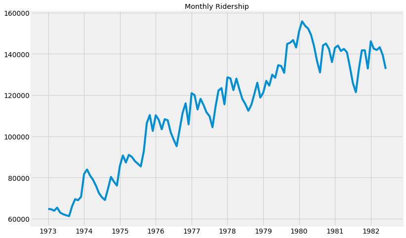
3) 시각화 (Visualization)
- 안정적 시계열이 아니다 !!!
df.riders.plot(
    figsize=(12, 8),
    title='Monthly Ridership',
    fontsize=14
)

plt.savefig(
    'month_ridership.png',
    bbox_inches='tight'
)
4) 안정화 및 적용할 통계 모형 찾기
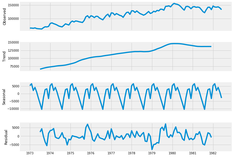
(1) 시계열 데이터의 요소 및 분해
- 시계열 데이터 = 패턴 + 랜덤
- 패턴 = 트랜드 패턴 + 주기 패턴 + seasonal 패턴 + 기타 통계적 패턴
- 시계열 데이터에서 패턴을 제거한 나머지(잔차)에 대해 ARIMA(p, q) 모형을 적용하여 p, q를 구하면 대략적으로 적용할 모델을 찾을 수 있다.
- 이를 통하여 예측할 수 있다.
(2) 모형 적용
- 랜덤 요소 : ARIMA, ARCH 등 적용
- 패턴 - 트랜드 : 다양한 통계 모형 적용
- 패턴 - Seasonal, 주기 : ACF, Fourier 방법
- 패턴 - 기타 통계적 방법 : 데이터 마이닝 기법 (의사결정나무, SVM 등)
decomposition = seasonal_decompose( df.riders, freq=12 )
fig = plt.figure()
fig = decomposition.plot()
fig.set_size_inches(12, 8)
<matplotlib.figure.Figure at 0x7f3e45cc85f8>
trend = decomposition.trend
seasonal = decomposition.seasonal
residual = decomposition.resid
(3) 그리드 서치 p, q
# Define the p, d and q parameters to take any value between 0 and 2
p = d = q = range(0, 2)

# Generate all different combinations of p, q and d triplets
pdq = list( itertools.product(p, d, q))

# Generate all different combinations of seasonal p, q and d triplets
seasonal_pdq = [ (x[0], x[1], x[2], 12)  for x in pdq ]

print('Example of parameter combinations for Seasonal ARIMA ...')
print('SARIMAX:  {} x {}'.format(pdq[1], seasonal_pdq[1]) )
print('SARIMAX:  {} x {}'.format(pdq[1], seasonal_pdq[2]) )
print('SARIMAX:  {} x {}'.format(pdq[2], seasonal_pdq[3]) )
print('SARIMAX:  {} x {}'.format(pdq[2], seasonal_pdq[4]) )
Example of parameter combinations for Seasonal ARIMA ...
SARIMAX:  (0, 0, 1) x (0, 0, 1, 12)
SARIMAX:  (0, 0, 1) x (0, 1, 0, 12)
SARIMAX:  (0, 1, 0) x (0, 1, 1, 12)
SARIMAX:  (0, 1, 0) x (1, 0, 0, 12)
warnings.filterwarnings("ignore")

select_candi = 10000000
param_candi = ( 0, 0, 0 )
param_seasonal_candi = ( 0, 0, 0)

count=0
end_count = len(pdq)

for param in pdq:
    for param_seasonal in seasonal_pdq:
        try:
            mod = sm.tsa.statespace.SARIMAX( df['riders'],
                                            order=param,
                                            seasonal_order=param_seasonal,
                                            enforce_stationarity=False,
                                            enforce_invertibility=False
                                           )
            results = mod.fit()
            count += 1
            if count <= 5:
                print('ARIMA{}x{}12 - AIC:{}'.format(param, param_seasonal, results.aic))

            if results.aic < select_candi:
                select_candi = results.aic
                param_candi = param
                param_seasonal_candi = param_seasonal
        except:
            continue

print(param_candi, param_seasonal_candi, select_candi)
ARIMA(0, 0, 0)x(0, 0, 1, 12)12 - AIC:2595.3864799134485
ARIMA(0, 0, 0)x(0, 1, 1, 12)12 - AIC:1948.42720635445
ARIMA(0, 0, 0)x(1, 0, 0, 12)12 - AIC:2200.3535348493824
ARIMA(0, 0, 0)x(1, 0, 1, 12)12 - AIC:2178.6806032356317
ARIMA(0, 0, 0)x(1, 1, 0, 12)12 - AIC:1962.501941516448
(0, 1, 1) (0, 1, 1, 12) 1688.69970004
mod = sm.tsa.statespace.SARIMAX(
    df['riders'],
    order=(0, 1, 1),
    seasonal_order=(0, 1, 1, 12),
    enforce_stationarity=False,
    enforce_invertibility=False
)

results = mod.fit()

print( results.summary().tables[1] )
==============================================================================
                 coef    std err          z      P>|z|      [0.025      0.975]
------------------------------------------------------------------------------
ma.L1          0.0244      0.099      0.246      0.806      -0.170       0.219
ma.S.L12      -0.3808      0.072     -5.256      0.000      -0.523      -0.239
sigma2      1.519e+07   2.14e+06      7.089      0.000     1.1e+07    1.94e+07
==============================================================================
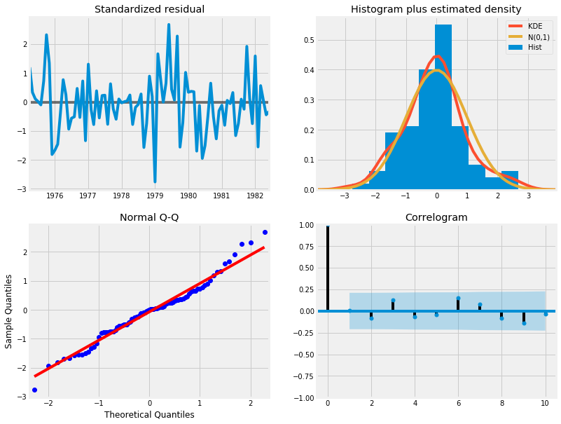
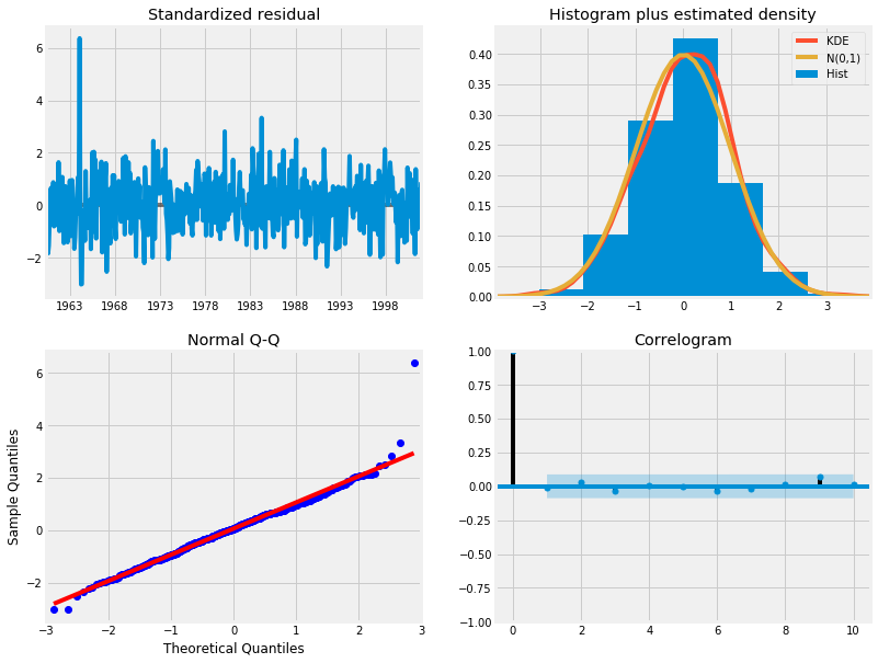
results.plot_diagnostics( figsize=(12, 10) )
plt.show()
(4) 분석
- Histogram plus estimated density에서 KDE, N(0,1)이 정규분포를 따르는 것으로 보인다.
- Normal Q-Q 에서 선형성이 두드러진다.
- Standardized residual에서 어떤 경향성도 보이지 않아 White Noise로 보인다.
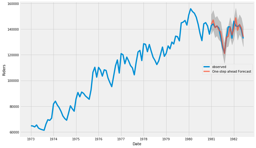
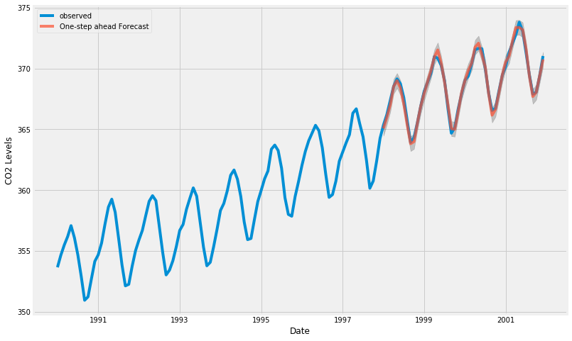
(5) 예측 관찰
- 원 데이터의 시계열이 73년부터 82년 중반까지이다.
- 예측을 1981. 1. 1.부터 한다면, 73년부터 1980.12.31.까지의 데이터를 바탕으로 한 예측에 대해 원 데이터의 1981.1.1.부터 82년 중반까지의 데이터와 비교해 볼 수 있다.
pred = results.get_prediction(
    start=pd.to_datetime('1981-01-01'),
    dynamic=False
)

pred_ci = pred.conf_int()
# 관측 데이터  1973년 부터 끝까지
ax = df['riders']['1973' : ].plot( label='observed', figsize=(12, 8) )

# 예측
pred.predicted_mean.plot(
    ax=ax,
    label='One-step ahead Forecast',
    alpha=.7
)

ax.fill_between(
    pred_ci.index,
    pred_ci['lower riders'],
    pred_ci['upper riders'],
    color='k',
    alpha=.2
)

ax.set_xlabel('Date')
ax.set_ylabel('Riders')
plt.legend(loc=5)

plt.show()
y_forecasted = pred.predicted_mean
y_truth = df['riders']['1981-01-01' : ]

# Compute the Mean Square Error
mse = (( y_forecasted - y_truth ) ** 2).mean()
print('The Mean Squared Error of our forecasts is {}'.format( round(mse, 2) ) )
The Mean Squared Error of our forecasts is 10215528.27
pred_dynamic = results.get_prediction(
    start=pd.to_datetime('1981-01-01'),
    dynamic=True,
    full_results=True
)

pred_dynamic_ci = pred_dynamic.conf_int()
# 관측 데이터  1973년 부터 끝까지
ax = df['riders']['1973' : ].plot( label='observed', figsize=(12, 8) )

# 예측
pred_dynamic.predicted_mean.plot(
    ax=ax,
    label='Dynamic Forcast'
)

ax.fill_between(
    pred_ci.index,
    pred_ci['lower riders'],
    pred_ci['upper riders'],
    color='k',
    alpha=.2
)

ax.fill_betweenx(
    ax.get_ylim(),
    pd.to_datetime('1981-01-01'),
    df.index[-1],
    alpha=.3
)

ax.set_xlabel('Date')
ax.set_ylabel('Riders')
plt.legend(loc=9)

plt.show()
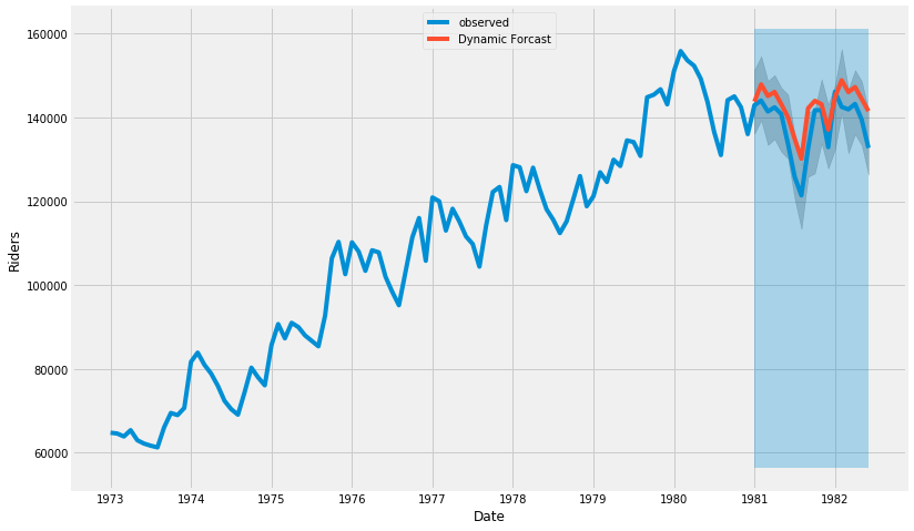
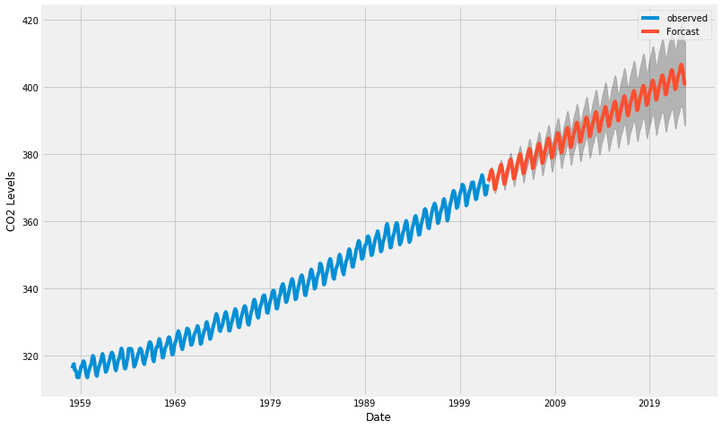
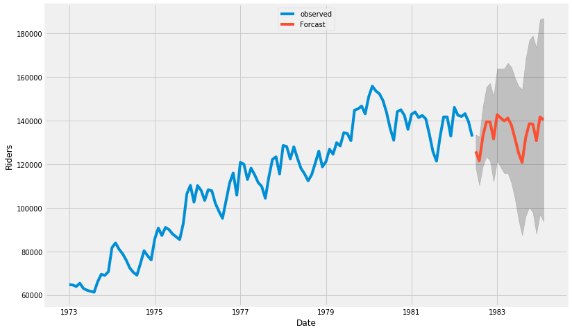
(6) 예측
- 관측 데이터(~82년 중반까지)를 넘어서서 그 이후의 모습을 예측하는 그래프를 그린다.
# Extract the predicted and true values of our time series
y_forecasted = pred_dynamic.predicted_mean
y_truth = df['riders']['1981-01-01' : ]

# Compute the Mean Square Error
mse = (( y_forecasted - y_truth ) ** 2).mean()
print('The Mean Squared Error of our forecasts is {}'.format( round(mse, 2) ) )
The Mean Squared Error of our forecasts is 30029929.6
# Get forecast some steps ahead in future
pred_uc = results.get_forecast( steps=20 )

# Get confidence intervals of forecasts
pred_ci = pred_uc.conf_int()
# 관측 데이터  1973년 부터 끝까지
ax = df['riders']['1973' : ].plot( label='observed', figsize=(12, 8) )

# 예측
pred_uc.predicted_mean.plot(
    ax=ax,
    label='Forcast'
)

ax.fill_between(
    pred_ci.index,
    pred_ci['lower riders'],
    pred_ci['upper riders'],
    color='k',
    alpha=.2
)


ax.set_xlabel('Date')
ax.set_ylabel('Riders')
plt.legend(loc=9)

plt.show()
3. statsmodels : 예제2- 하와이 대기 CO2비중
- Atmospheric CO2 from Continous Air Samples at Mauna Loa Observatory, Hawaii, U.S.A.
1) 데이터 얻기
data = sm.datasets.co2.load_pandas()
y = data.data
y.head()
| co2 | |
|---|---|
| 1958-03-29 | 316.1 |
| 1958-04-05 | 317.3 |
| 1958-04-12 | 317.6 |
| 1958-04-19 | 317.5 |
| 1958-04-26 | 316.4 |
y = y['co2'].resample('MS').mean()
y = y.fillna(y.bfill())
y.head()
1958-03-01    316.100000
1958-04-01    317.200000
1958-05-01    317.433333
1958-06-01    315.625000
1958-07-01    315.625000
Freq: MS, Name: co2, dtype: float64
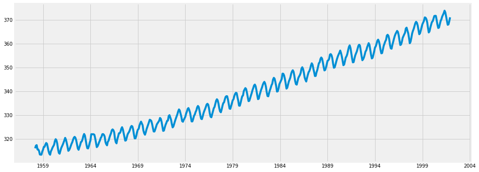
2) 기본 그래프
y.plot( figsize=(15, 6) )
plt.show()
3) 그리드 서치
# Define the p, d and q parameters to take any value between 0 and 2
p = d = q = range(0, 2)

# Generate all different combinations of p, q and d triplets
pdq = list( itertools.product(p, d, q))

# Generate all different combinations of seasonal p, q and d triplets
seasonal_pdq = [ (x[0], x[1], x[2], 12)  for x in pdq ]

print('Example of parameter combinations for Seasonal ARIMA ...')
print('SARIMAX:  {} x {}'.format(pdq[1], seasonal_pdq[1]) )
print('SARIMAX:  {} x {}'.format(pdq[1], seasonal_pdq[2]) )
print('SARIMAX:  {} x {}'.format(pdq[2], seasonal_pdq[3]) )
print('SARIMAX:  {} x {}'.format(pdq[2], seasonal_pdq[4]) )
Example of parameter combinations for Seasonal ARIMA ...
SARIMAX:  (0, 0, 1) x (0, 0, 1, 12)
SARIMAX:  (0, 0, 1) x (0, 1, 0, 12)
SARIMAX:  (0, 1, 0) x (0, 1, 1, 12)
SARIMAX:  (0, 1, 0) x (1, 0, 0, 12)
warnings.filterwarnings("ignore")

select_candi = 10000000
param_candi = ( 0, 0, 0 )
param_seasonal_candi = ( 0, 0, 0)

count=0
end_count = len(pdq)

for param in pdq:
    for param_seasonal in seasonal_pdq:
        try:
            mod = sm.tsa.statespace.SARIMAX(
                                           # 여기 !!!
                                            y,
                                            order=param,
                                            seasonal_order=param_seasonal,
                                            enforce_stationarity=False,
                                            enforce_invertibility=False
                                           )
            results = mod.fit()
            count += 1
            if count <= 5:
                print('ARIMA{}x{}12 - AIC:{}'.format(param, param_seasonal, results.aic))

            if results.aic < select_candi:
                select_candi = results.aic
                param_candi = param
                param_seasonal_candi = param_seasonal
        except:
            continue

print(param_candi, param_seasonal_candi, select_candi)
ARIMA(0, 0, 0)x(0, 0, 1, 12)12 - AIC:6787.343624040217
ARIMA(0, 0, 0)x(0, 1, 1, 12)12 - AIC:1596.711172764377
ARIMA(0, 0, 0)x(1, 0, 0, 12)12 - AIC:1058.9388921320035
ARIMA(0, 0, 0)x(1, 0, 1, 12)12 - AIC:1056.2878485614463
ARIMA(0, 0, 0)x(1, 1, 0, 12)12 - AIC:1361.6578978073326
(1, 1, 1) (1, 1, 1, 12) 277.780217493
mod = sm.tsa.statespace.SARIMAX(
    y,
    order=(1, 1, 1),
    seasonal_order=(1, 1, 1, 12),
    enforce_stationarity=False,
    enforce_invertibility=False
)

results = mod.fit()

print( results.summary().tables[1] )
==============================================================================
                 coef    std err          z      P>|z|      [0.025      0.975]
------------------------------------------------------------------------------
ar.L1          0.3182      0.092      3.442      0.001       0.137       0.499
ma.L1         -0.6254      0.077     -8.164      0.000      -0.776      -0.475
ar.S.L12       0.0010      0.001      1.732      0.083      -0.000       0.002
ma.S.L12      -0.8769      0.026    -33.811      0.000      -0.928      -0.826
sigma2         0.0972      0.004     22.632      0.000       0.089       0.106
==============================================================================
results.plot_diagnostics( figsize=(12, 10) )
plt.show()
pred = results.get_prediction(
    start=pd.to_datetime('1998-01-01'),
    dynamic=False
)

pred_ci = pred.conf_int()
# 관측 데이터  1973년 부터 끝까지
ax = y[ '1990' : ].plot( label='observed', figsize=(12, 8) )

# 예측
pred.predicted_mean.plot(
    ax=ax,
    label='One-step ahead Forecast',
    alpha=.7
)

ax.fill_between(
    pred_ci.index,
    pred_ci.iloc[ : , 0 ],
    pred_ci.iloc[ : , 1 ],
    color='k',
    alpha=.2
)

ax.set_xlabel('Date')
ax.set_ylabel('CO2 Levels')
plt.legend()

plt.show()
y_forecasted = pred.predicted_mean
y_truth = y['1998-01-01' : ]

# Compute the Mean Square Error
mse = (( y_forecasted - y_truth ) ** 2).mean()
print('The Mean Squared Error of our forecasts is {}'.format( round(mse, 2) ) )
The Mean Squared Error of our forecasts is 0.07
pred_dynamic = results.get_prediction(
    start=pd.to_datetime('1998-01-01'),
    dynamic=True,
    full_results=True
)

pred_dynamic_ci = pred_dynamic.conf_int()
# 관측 데이터  1973년 부터 끝까지
ax = y['1990' : ].plot( label='observed', figsize=(12, 8) )

# 예측
pred_dynamic.predicted_mean.plot(
    ax=ax,
    label='Dynamic Forcast'
)

ax.fill_between(
    pred_ci.index,
    pred_ci.iloc[ : , 0 ],
    pred_ci.iloc[ : , 1 ],
    color='k',
    alpha=.25
)

ax.fill_betweenx(
    ax.get_ylim(),
    pd.to_datetime('1998-01-01'),
    y.index[-1],
    alpha=.1,
    zorder=-1
)

ax.set_xlabel('Date')
ax.set_ylabel('CO2 Levels')
plt.legend()

plt.show()
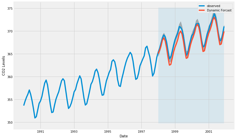
# Extract the predicted and true values of our time series
y_forecasted = pred_dynamic.predicted_mean
y_truth = y['1998-01-01' : ]

# Compute the Mean Square Error
mse = (( y_forecasted - y_truth ) ** 2).mean()
print('The Mean Squared Error of our forecasts is {}'.format( round(mse, 2) ) )
The Mean Squared Error of our forecasts is 1.01
# Get forecast some steps ahead in future
pred_uc = results.get_forecast( steps=250 )

# Get confidence intervals of forecasts
pred_ci = pred_uc.conf_int()
# 관측 데이터  1973년 부터 끝까지
ax = y.plot( label='observed', figsize=(12, 8) )

# 예측
pred_uc.predicted_mean.plot(
    ax=ax,
    label='Forcast'
)

ax.fill_between(
    pred_ci.index,
    pred_ci.iloc[ : , 0 ],
    pred_ci.iloc[ : , 1 ],
    color='k',
    alpha=.25
)


ax.set_xlabel('Date')
ax.set_ylabel('CO2 Levels')
plt.legend()

plt.show()